User Testing

Usability Testing
Instructions for the user:
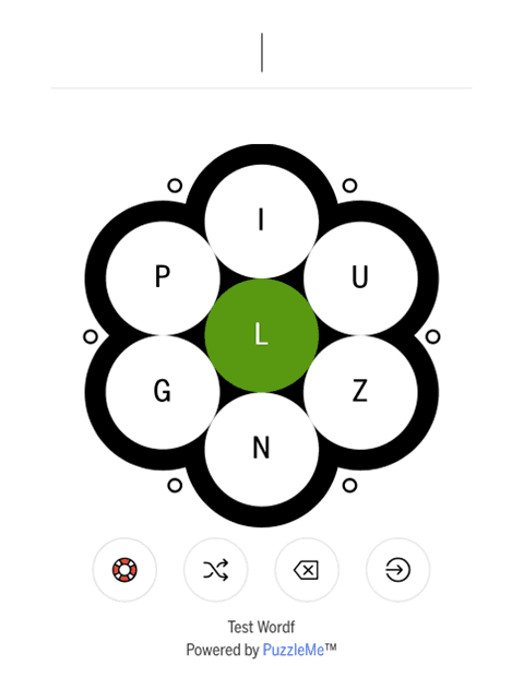
Click on the following link to open a Word Flower Puzzle:
Solve the puzzle and speak what you think. If you feel completely stuck somewhere in the game platform, you may ask for help.
Interview Questions :
What were your first thoughts when you opened the platform?
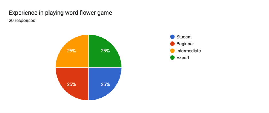
How experienced are you in solving word flower puzzles?
Was the interface easy to understand?
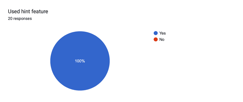
Did you try using any specific features available on the platform? Did you find them helpful?
Asking about the specific features, the player didn’t try.
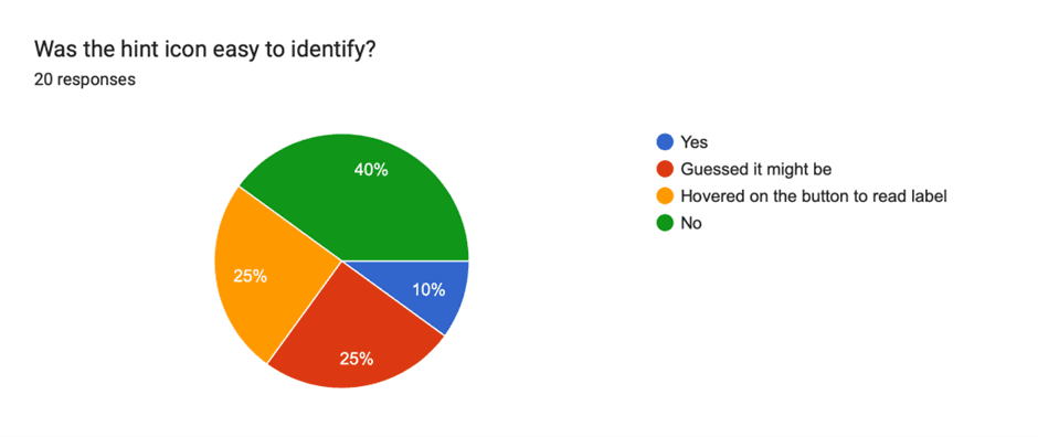
Any feature, user found confusing. Was the intent of the feature/ setting clear with its title/ icon?
Did they find the feature, where they can play with friends?
What did you like the best in the platform?
What do you think about the accessibility in the sudoku puzzle? Visibility, font size
General comments about the UI and visibility of features and settings.
Have you tried any other online word flower platform? What additional features did you like there, that should be there in our platform as well?
How well do you think our product performed compared to your expectations?
General comments


Findings from User Testing
Hint:
The hint should stay when a player is typing.
It should go on clicking the enter button.
It should reveal some other letters as well. Just starting letters are not enough, especially for longer words. First letter along with some letter in the middle or end will be much more helpful in guessing the word.
“After one point, I cannot think of more words starting with the suggested letter"
Some hints could be like- try adding prefix or suffix to the words you have already formed". Or _ _ _ _ ING (7) , UN_ _ _ _ _ _ _ (9). Many players could not think, suffix ING could be added to the already formed words.
Hints should come based on the letters they have typed. Eg, if a player typed PU and clicked on hint, they expect the hint to give clues of words, starting from PU.
"Can I ask for a hint after typing a few letters? Give the last 2 letters, if I typed starting letters. I will guess the middle letters. It will be interesting this way!"
If there are no words starting with PU, the message could be “Words already found”
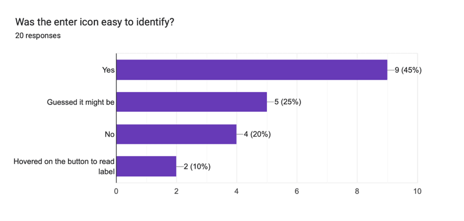
Users could not identify the hint icon. Desktop users hovered to see the icon label.
Milestone
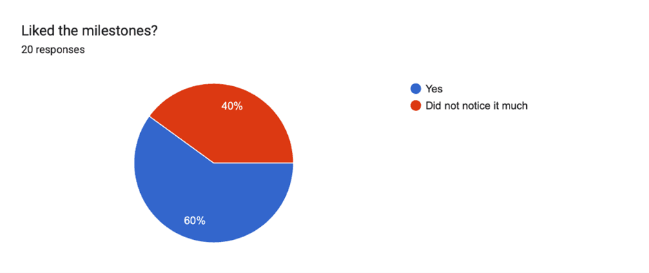
It is not evident when a new milestone is achieved.
Players are not clear after how many words, will a new milestone be achieved?
Game completion
Users are expecting an “End game”/ “Finish game” button. They are confused about what to do, once they are done guessing all the words they could.
Many players even clicked on Save button
Mobile users could not even find the reveal button.
For mobile users, the reveal button is not upfront, they don't realize, they can even reveal words. They struggled to end the game.
Hitting “Reveal” feels like giving up. (Players related to the context how they use reveal grid in crossword game. It feels like cheating)


Reveal
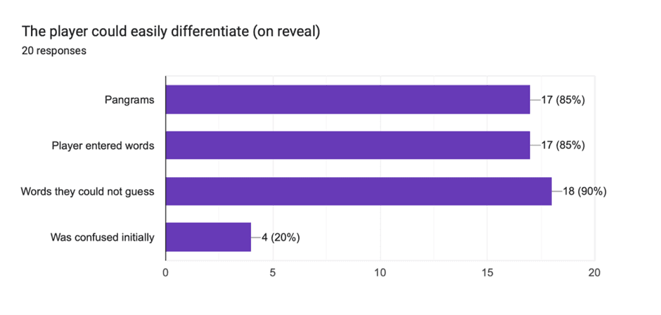
Players don't realize where words are revealed. When they hit reveal, the end modal pops up.
“Oh! Why is it not showing the revealed words?”
If the pangram is not found by the player, the star is coming in gray color. It should be in the same color as the revealed words
Some players felt confused, why are the words marked with yellow? Did they make some mistake? (In partner mode revealed words come in yellow)

Partner Mode
If a partner is added later to the game, but the first player has already formed some words, the already formed words come with a blue mark to the new player (same as his own color) even though, the first player had created those words.


Visuals
Many players found the little circles around the flower distracting. They thought they were buttons or some sort of clues.
Few beginners did not realize they had to type by clicking on the letters on the screens. They were tapping on the input field for the keyboard to open. The letters are buttons were not intuitive enough.