India Mini Crossword is a daily puzzle published by Amuse Labs on its Puzzle Me platform, featuring clues based on Indian contexts. Despite its engaging content, the platform currently has a limited daily user base.
To address this, I organized a design thinking workshop where we collaboratively brainstormed strategies to increase daily plays from 200 to 5000.
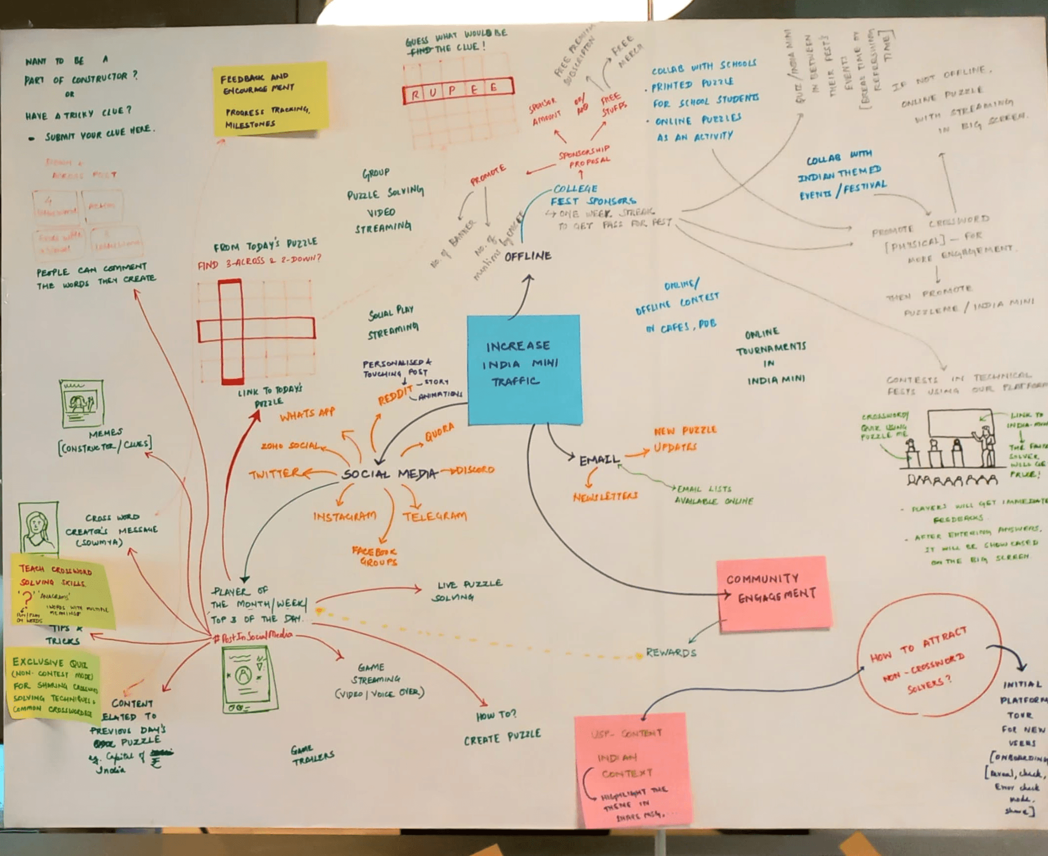
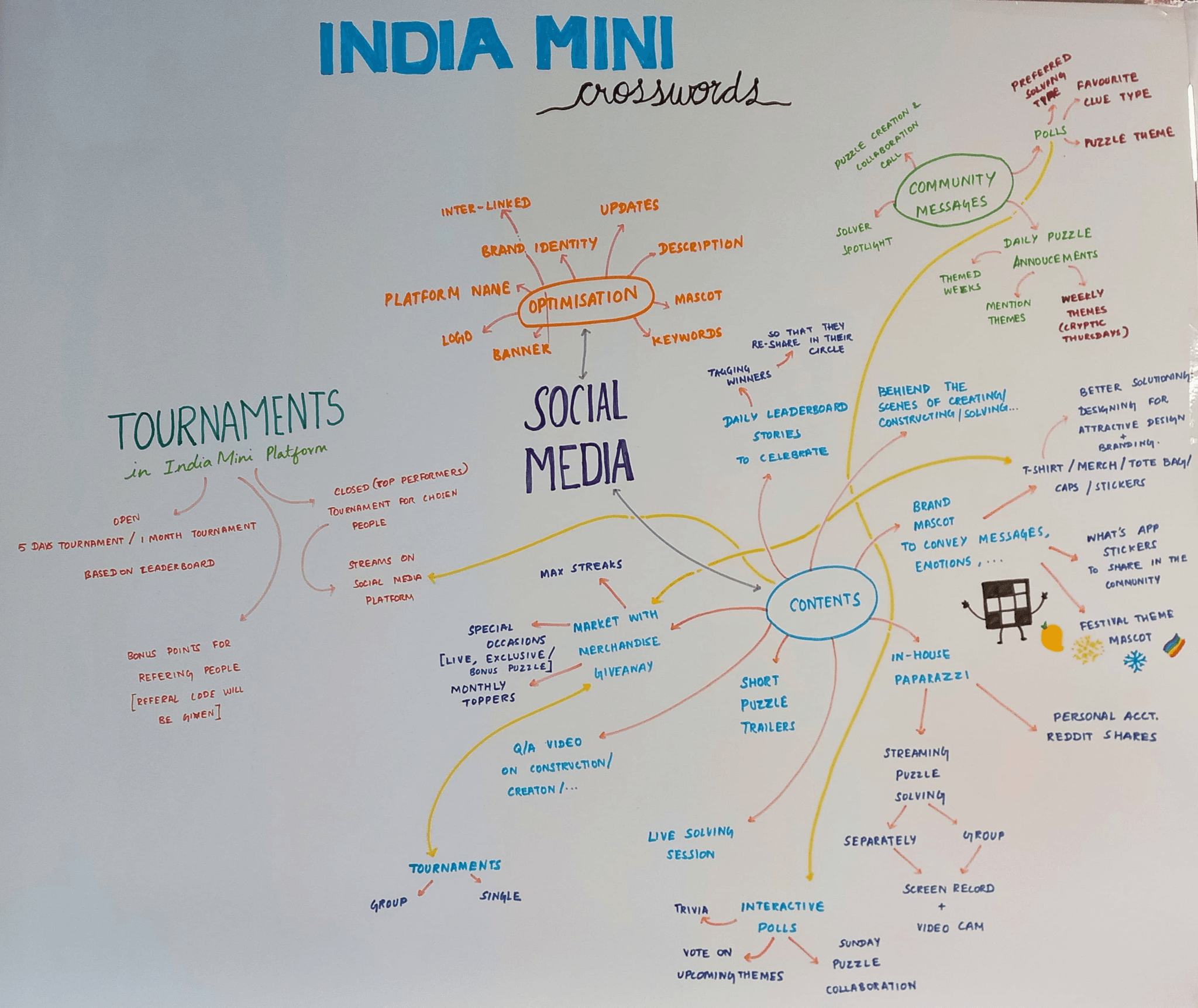
Ideation was done on different ideas like:
Social Media engagement
Tournaments
Community Engagement
Constructor engagement
Schools / Universities tie ups
Brand Optimisation
Onboarding for new users
Highlighting the USP of India Mini
Sending updates about new puzzle publishing
Rewards/ recognition
We decided to create a mascot for India Mini Crossword to add a creative touch to the game. The mascot will help convey emotions better and make the puzzle more engaging.
Start Screen
Pause Screen
End Screen
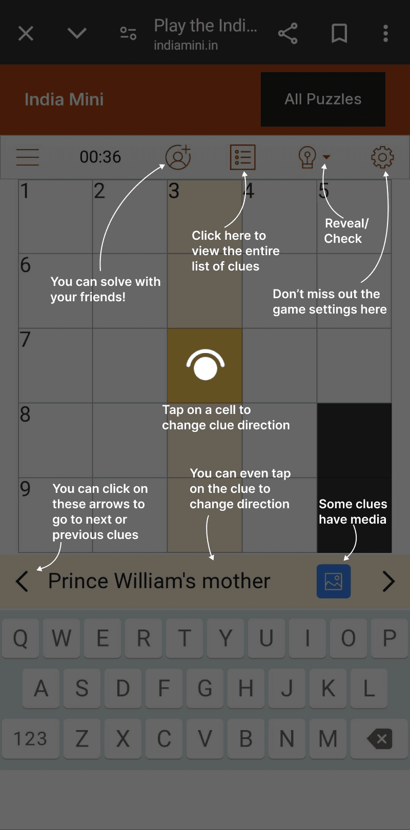
User testing was conducted to identify any areas where players might be getting stuck or frustrated. We assessed whether users could easily find and use the different features available in the game and if they were able to fill in the puzzle effortlessly.
Instructions for the user:
Click on the following link to open an India Mini Crossword Puzzle:
Solve the puzzle and speak what you think. If you feel completely stuck somewhere in the game platform, you may ask for help.
Interview Questions :
What were your first thoughts when you opened the platform?
How did you like solving the crossword puzzle on an online platform.
How experienced are you in solving crossword puzzles?
Was the interface easy to understand?
Did you try using any specific features available on the platform? Did you find them helpful?
Asking about the specific features, the player didn’t try.
Any feature, you found confusing. Was the intent of the feature/ setting clear with its title/ icon?
Did you find the feature, where you can play with friends?
What did you like the best in the platform?
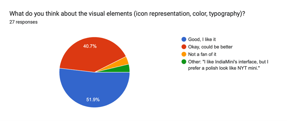
What do you think about the accessibility in the crossword puzzle? Visibility, font size
General comments about the UI and visibility of features and settings.
Have you tried any other online crossword platform? What additional features did you like there, that should be there in our platform as well?
How well do you think our product performed compared to your expectations?
General comments
Observations:
Understanding the interface
The users found interface easy to understand.

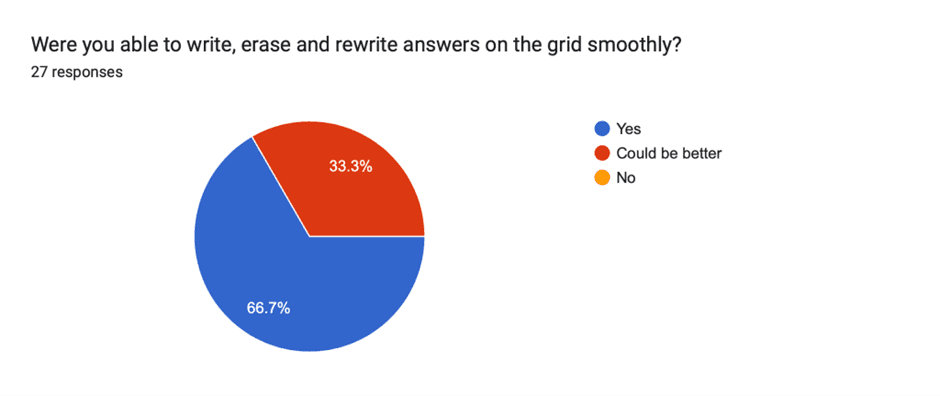
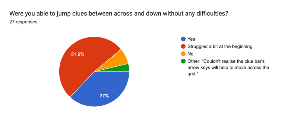
Swapping b/w across and down
All the new users are struggling in the initial minutes to figure out how to toggle between accross and down
Desktop users liked the highlight in the grid of the corresponding clue.

Finding Settings
Users are not opening it. Even if they are searching for a particular setting, still they don't open it. Major reasons:
1. The timer is running, would have explored it before the game starts
2. Assume that it would have software related settings like dark mode, timer, sound, etc. Not, game features.
3. Feel like it will break their flow of solving the puzzle
4. Think it is not relevent for them. Because, as a new user, they think the best settings must be ON by default.

List Mode
Players found list mode good.

Apply Button
Many users missed the apply button, as it got hidden in the scroll for some, while some users didn't expect this button to be there. This led to confusion, why is the setting not being applied?
Clear Button
Many users could not find it. They were expecting some other label like "Restart" or "Play Again"
Error check mode
Did not knew about it. Did not open settings. Should have been given a advice in beginning
Reveal and Check
Mobile users could not realise there are reveal and check features
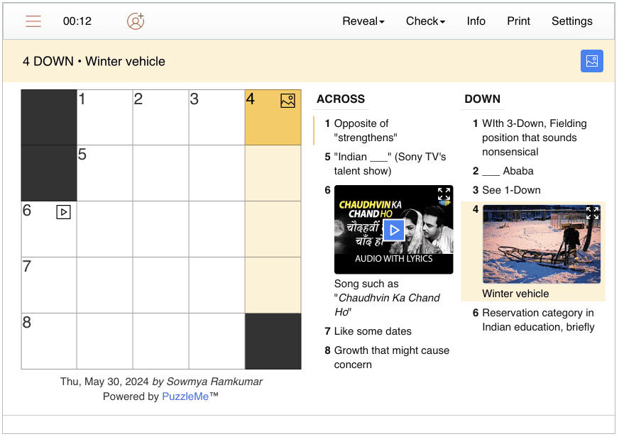
Images
Some users clicking on image icon in the grid to view the image.
Mobile users not noticing the blue image icon in the clue


Accessibilty
Good
Pause and Play
Not Clear its a button. After pausing also, the pause state is not clear

Major Areas of Frustration
Toggling accross and down,
Clear button
Not seeing the blue image icon in mobile mode
Recommendations by users
Once the puzzle is completed, on the game window, it should be written - "Your puzzle is completed"
There should be a Play Again button upfront on the screen
The end modal should come after a pause of 2 sec, if the player has selected reveal in the end, so that they can read what the correct answer is.
Reaction on end of puzzle
Players were happy on completing the puzzle
Some got frustrated, for not being able to find the Play Again button
Results of User Testing:
Changes which should be implemented immediately:
Change ‘Clear’ to ‘Restart’.
Add ‘Play Again/ Restart’ button in the end modal.
Add a play/ pause button near the timer. Timer should pause, if the player is accessing the settings or hamburger menu.
An expand icon can be added on the top right corner of the media, instead of the blue image icon on the clue bar. The play icon over the video should be clickable.
Add ‘Help Guide’ button on start modal.