UX Audit and User Testing
Sudoku UX Audit
Heuristic Evaluation:
Heuristic Evaluation is a thorough assessment of a product’s user interface and its purpose to detect usability issues that may occur when users interact with a product and identify ways to resolve them.
Severity Rating Scale:
🟦 Minor (Slight usability issues that might cause minor user inconvenience)
🟨 Moderate (Usability issues that noticeably affect user tasks and can lead to frustration)
🟥 Critical (Significant usability issues that hinder users from completing important tasks)
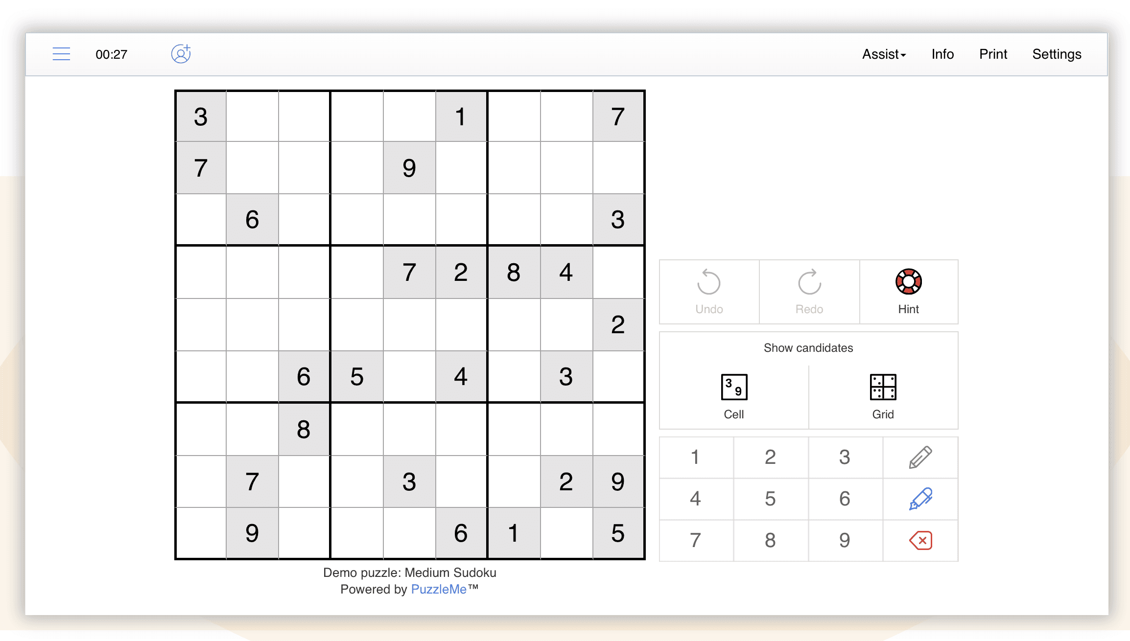
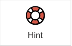
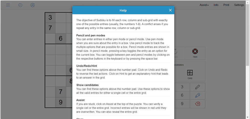
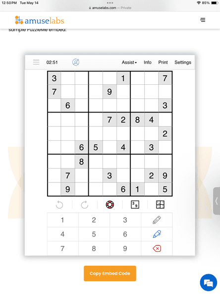
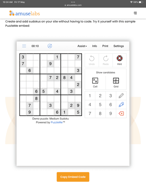
1: Icons:
This hint icon could be difficult to understand. A traditional bulb icon would be more intuitive to users.
Severity Rating Scale: 🟦 Minor
Law: Match Between the System and the Real World
2. Pause & Play:
The pause status is not very clear. The puzzle should not be visible to the players when it’s in pause state. Also, there could be a pause and play icon, since the clock icon doesn’t convey the pause state, or as a button to resume the game.

Severity Rating Scale: 🟨 Moderate
Law: Visibility of System Status
While the player is accessing settings, the timer should be paused. The time to edit the settings should not be considered in the time taken to solve the puzzle.
Severity Rating Scale: 🟦 Minor
Law: Flexibility and Efficiency of Use
3. Pencil and Pen:
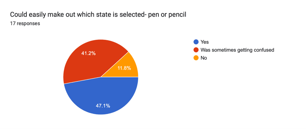
The current state- Pen or pencil, is not very clear, as blue stroke in the pen icon also suggests, it could be the default state color for pen.
On toggling between Pen and pencil using spacebar, the change status is not very evident. There should be a gray highlight in the button fill while using the spacebar.
Severity Rating Scale: 🟨 Moderate
Law: Visibility of System Status
4. Apply button in Settings Modal:
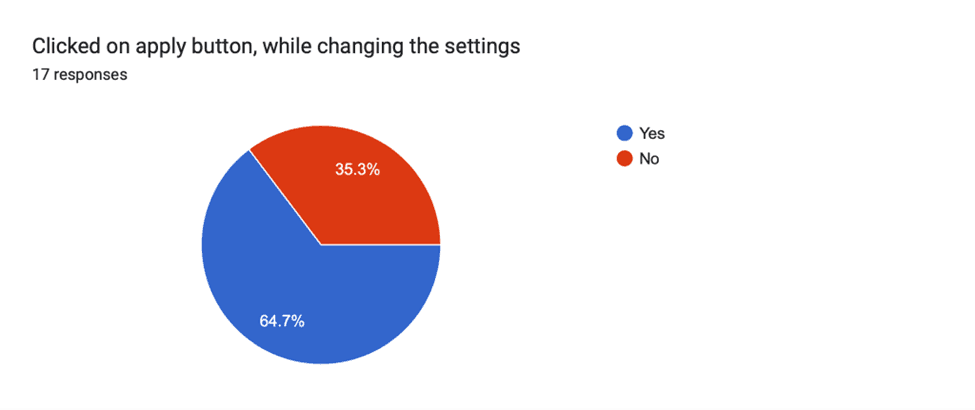
There could be a possibility that the users miss the apply button while changing the settings, as it could hide in scroll.
There can be a cancel button along with an apply button.
Severity Rating Scale: 🟦 Minor
Law: Visibility of System Status
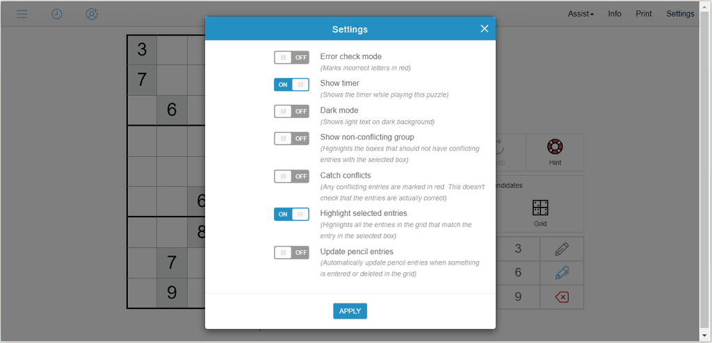
Update pencil entries and error check mode could be turned on as default settings. And if the Show candidate is in use and the Update pencil entries are turned on there will be no use of pencil unless the user deletes the cell entries/candidates. So we can disable the pencil in this case.
Severity Rating Scale: 🟦 Minor
Law: Flexibility and Efficiency of Use
5. Candidate:
Instead of “Cell”, “Selected Cell” could be written. Because, a player must select a cell to view candidates. If a cell is not selected, they get a warning- Select a cell first. This will help increase the efficiency and reduce the number of clicks.

The cell icon could also have dots instead of numbers to have a consistency in both the icons, suggesting both cell and grid buttons are for showing candidates.
Severity Rating Scale: 🟨 Moderate
Law: Recognition Rather than Recall
Show cell candidates should be disabled when the show candidate grid feature is in use. The show candidate cell can be again enabled when the user erases any cell entries.
Severity Rating Scale: 🟦 Minor
Law: Visibility of System Status
Show candidates button, should have the ability to hide the candidates also. It could have been like a toggle to show and hide candidates.
The undo button works if the user wants to hide the candidates. But if the user left the puzzle page with the Show candidate grid on, when the user comes back the undo button will be disabled. In this case the user will not be able to hide the candidates.
Severity Rating Scale: 🟨 Moderate
Law: User Control and Freedom
6. Differentiating Entries:
The cells can be differentiated based on the actions (Reveal, Check - correct cell and Check - wrong cell). Instead of users recalling the answers themself, recognising by the differentiation will be a better approach.
Severity Rating Scale: 🟦 Minor
Law: Match Between the System and the Real World
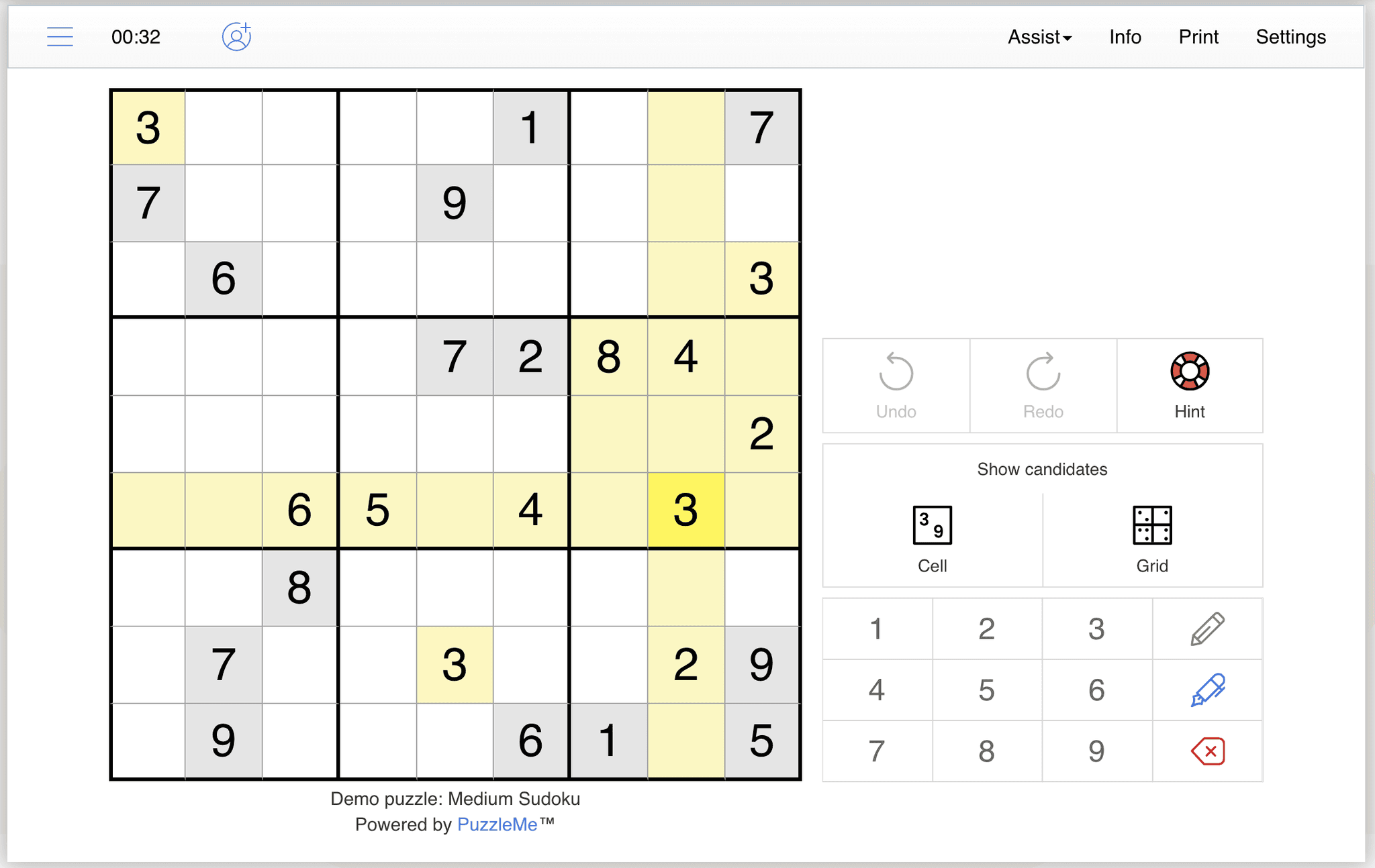
On highlighting selected entries, there is no distinction between the prefilled entries and the ones filled by the player. The prefilled entries could be highlighted in bold.
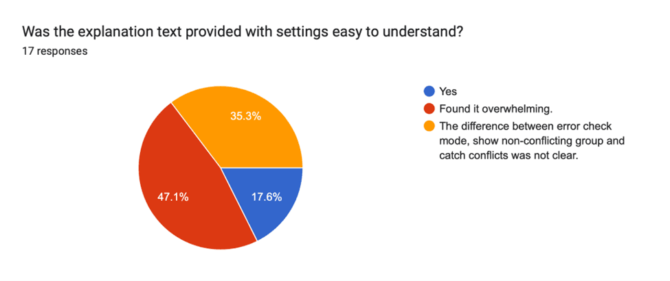
Show non-conflicting group has the same colour as highlight selected entries, which can increase the cognitive load of the players.
Severity Rating Scale: 🟦 Minor
Law: Consistency and Standards
7. Undo & Redo:
The keyboard shortcuts should work for the undo and redo, since the control is given to the numbers in the keyboard, users will expect the undo/redo should have the same control.
Severity Rating Scale: 🟦 Minor
Law: User Control and Freedom
8. Help:
Toggling between pen and pencil mode is an important shortcut, but it is mentioned deep inside the help section, which could be missed by many users. Some important shortcuts and settings should be visible upfront to the users.
Maybe, there could be an onboarding guide with pop-ups mentioning about the different features, settings and shortcuts, which could be helpful for the new users. Or the help section could be on the navigation bar instead of the info/print option.
Severity Rating Scale: 🟥 Critical
Law: Help and Documentation
End Modal Copy:
If the user is revealing the entire grid, based on the correct entries we can customize the message instead of showing congratulations.
Severity Rating Scale: 🟦 Minor
Law: Match Between the System and the Real World

10. Responsiveness:
iPad 6: The puzzle doesn’t have a padding below the keyboard in portrait orientation.
Severity Rating Scale: 🟦 Minor
Law: Aesthetic and Minimalist Design
iPad Air 4: In portrait orientation, there is a block of whitespace below the puzzle where new users might think something is yet to load.
Severity Rating Scale: 🟦 Minor
Law: Aesthetic and Minimalist Design
Usability Testing
Instructions for the user:
Click on the following link to open a Sudoku Puzzle:
Solve the puzzle and speak what you think. If you feel completely stuck somewhere in the game platform, you may ask for help.
Interview Questions :
What were your first thoughts when you opened the platform?
How did you like solving the sudoku puzzle on an online platform.
How experienced are you in solving sudoku puzzles?
Was the interface easy to understand?
Did you try using any specific features available on the platform? Did you find them helpful?
Asking about the specific features, the player didn’t try.
Any feature, you found confusing. Was the intent of the feature/ setting clear with its title/ icon?
Did you find the feature, where you can play with friends?
What did you like the best in the platform?
What do you think about the accessibility in the sudoku puzzle? Visibility, font size
General comments about the UI and visibility of features and settings.
Have you tried any other online sudoku platform? What additional features did you like there, that should be there in our platform as well?
How well do you think our product performed compared to your expectations?
General comments
Observations :
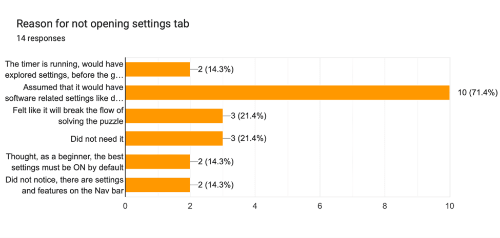
Settings tab
People do not open it. Even if, they are searching for a particular setting, they still they don't open it. Major reasons:
The timer is running, would have explored it before the game starts.
Assumed it would have software related settings like dark mode, timer, sound, etc. and not game features.
Felt like it will break their flow of solving the puzzle.
Thought it is not relevant for them. Because, as a new user, they think the best settings must be ON by default.

Error check mode
For beginners and intermediate players, half of the puzzle got wrong. This led to frustration and leaving the puzzle incomplete. These users expected error check to be ON by default
Many users don't know about this setting.
Even if they got to know about the setting, they did not want to go and find where is the setting.
Struggled to find the Setting

Pencil mode
What state is selected- Pen or pencil was not very evident.

Show non-conflicting group
Some players would have loved to use this feature, but did not knew it existed.
The highlight color of show non-conflicting group and highlight selected entry is same. This is leading to increased cognitive load to users.
Hint icon
Users were not able to understand the icon. Some users think, it is:
· Target
· Color change wheel
· Check button
· Wheel

Highlight Selected Entries
Most of the users found this feature to be very useful

Show Cell Candidates
Players did not select the cell and clicked on cell candidates and got warning messages to select a cell first
Show Grid Candidates
Users got frustrated as they could not turn it off.
Some got confused, as it did not update itself. If they deleted any cell, the candidates got updated wrong
Some cells did not show any candidates on updating the grid candidates. Users were very confused, why is it not showing? (It was because some entries were wrong). "There should have been some reasoning for that"

Assist- Check grid
Could not find check grid button, instead used hint icon for check grid

Apply button (settings)
Many users missed the apply button, as it got hidden in the scroll for some, while some users didn't expect this button to be there. This led to confusion, why is the setting not being applied?
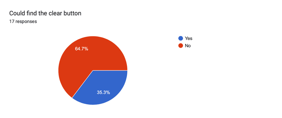
Clear button
Many users could not find clear. They were expecting some other label like "Restart" or "Play Again"
Pause/ play game
None of the user could realise, that puzzle can be paused/ played using the timer

Common areas of Frustration among users
Not able to find clear, settings, miss apply button
No way to turn off grid candidates- very confusing and distracting.
Expecting error check mode and auto-update cell entries to be ON by default
Icons difficult to understand, especially HINT.
"Not to keep settings so hidden. If I need to find it, I will not use it."
What state is selected- Pen or pencil was not very evident
Recommendations
Making help, features explanation graphical/ animated
Micro interaction on completing a row/ column
Keeping the settings more visible to the new users
Icons, along with text in the desktop nav bar.
Redo button can be removed
"There could be a progress bar, which highlights the percentage of puzzle I have completed. Based on that, I could update grid candidates- maybe, after every 25% of puzzle completion."
Changes to be implemented
Renaming "Help" to "How to Play".
Renaming "Clear" to "Restart".
Adding "pause-play" button near the timer
Warn about the number of errors.
Error check mode ON by default.
Update Pencil entries ON by default.
A different shade to be used for highlighting "selected entry" and "non-conflicting group".
Restart button on the end modal.
Making show candidates a toggle.
Disable ‘Show Cell Candidates’ option if cell is not selected.
Remove the ‘Apply’ button from the ‘Settings’ popup (Product level change)
Pen- Pencil selection state to be highlighted with a button fill